Will I lose Power? It’s a common question you may ask yourself as you look at an upcoming weather forecast.
It is a serious question, as losing power can have significant and unequal consequences for people. Lack of access to backup generators or alternative accommodations can significantly impact those with medical conditions or disabilities requiring powered medical equipment or temperature-controlled environments. Marginalized communities can be disproportionately affected by power outages due to systemic inequalities in access to resources & infrastructure. In extreme cases, prolonged power outages can even result in loss of life.
‘Will I lose power?’ is also a question that the weather forecast can’t directly answer – until now. CTAC has designed and built the COATI map to do just that. We have trained a Machine Learning (ML) model using millions of data points across multiple private and public data sets to create a predictive artificial intelligence (AI) tool. This tool will predict the probability of a power outage for each county in the United States, and in turn, uncover the vulnerability of each county’s at-risk population.
Project Goal
The themes at the AWS Public Sector event this year revolve around Equity, Health, Climate, and Customer Experience. Based on CTAC’s long history of supporting federal agencies in the public health sector, including HHS, CDC, and FDA, we realized CTAC had something meaningful to contribute to the event’s themes. Leveraging tools we built for the HHS EmPOWER system, we combined cutting-edge technology, agile methodologies, public big-data sets, and years of experience to build a novel proof-of-concept tool – the Climate-based Outage Analysis & Tracking Intelligence- or COATI. COATI was born to illustrate what can be done when you analyze and visualize data while leveraging machine learning and predictive artificial intelligence.
COATI Features
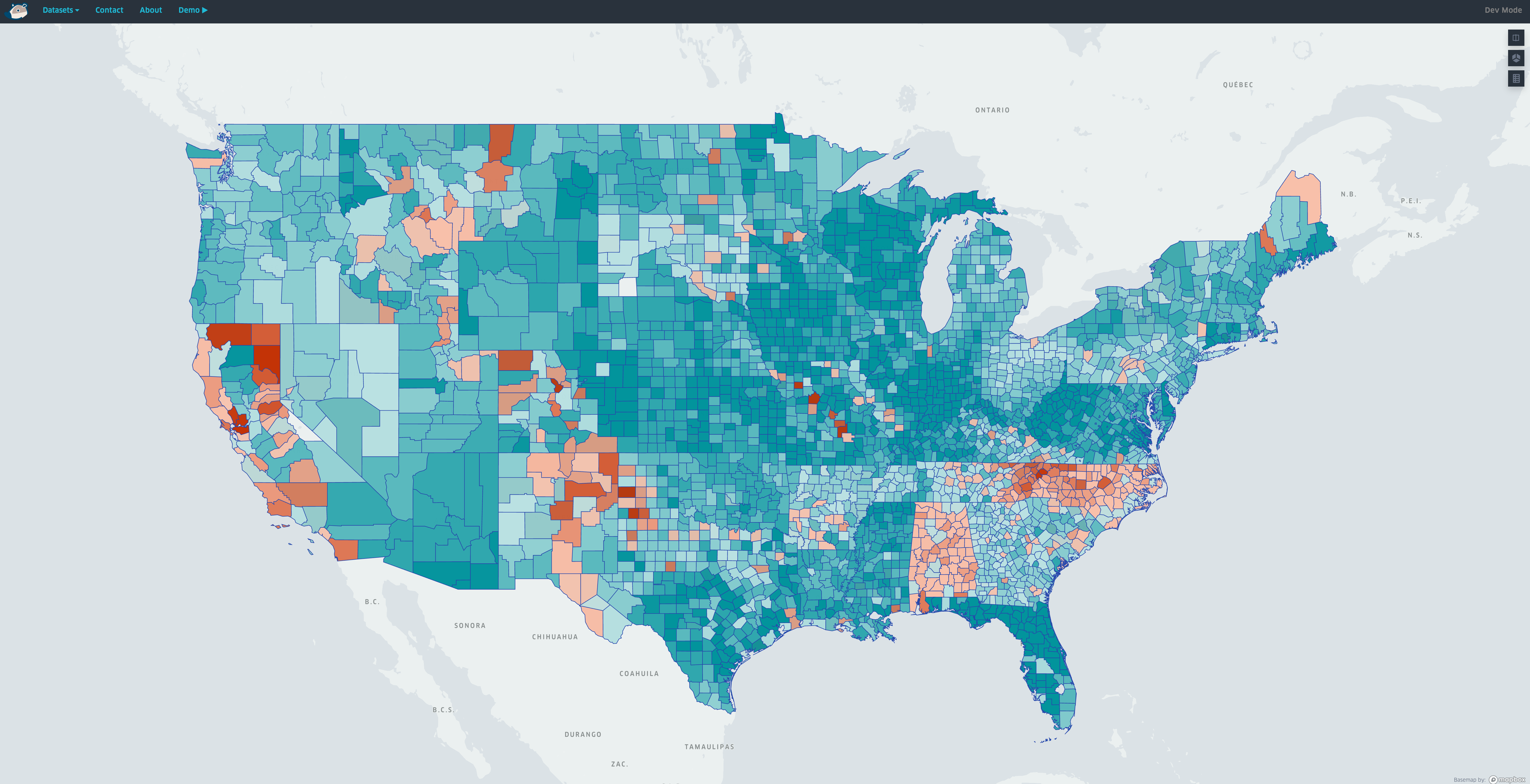
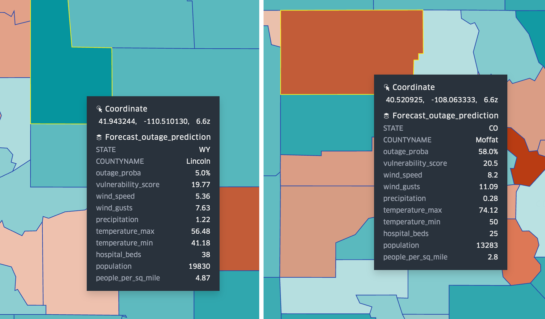
COATI features three main reporting views: 1) Probability of a Power Outage, 2) Vulnerability of the County’s Population, and 3) Regional Vulnerability (Heat map). The view which shows the Probability of a Power Outage view is titled ‘High Outage Chance’. Based on the upcoming seven-day forecast, it shows the entire US and each county’s predicted probability of losing power. The two screenshots below show the predictive outage probabilities for June 6-8, 2023 as of June 2, 2023. We can see that Fairfax County, Virginia has an 11% probability of losing power and Allegheny County, North Carolina has a 63% probability. By hovering over a selected county, the user can see several variables that contribute to the probability and vulnerability scores.
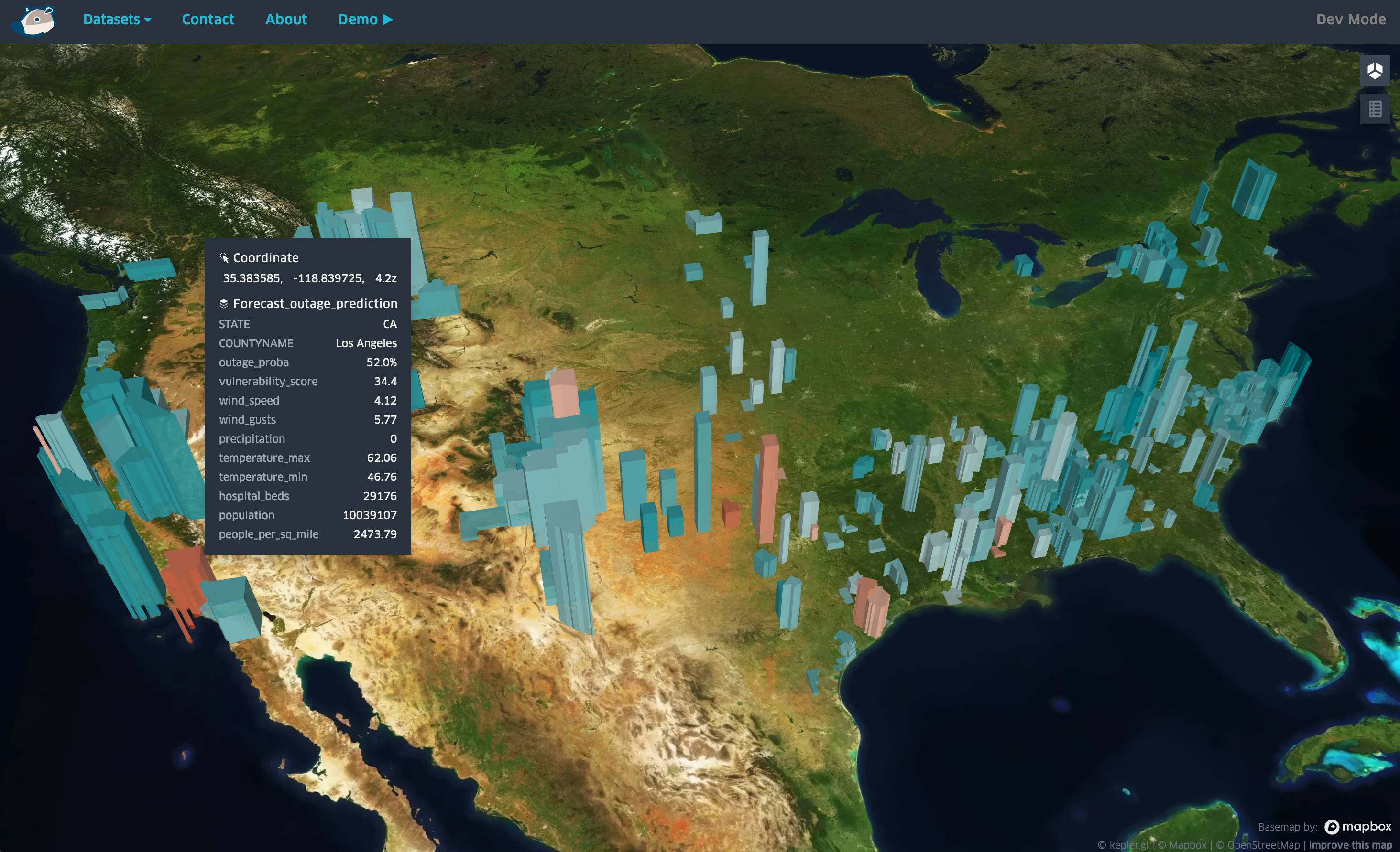
The second view titled ‘High Vulnerability’ provides COATI users with a filtered view of high vulnerability areas (See ‘Calculating Vulnerability’ below). The vertical height of the county shape indicates the probability of an outage, while the color of the country indicates the vulnerability of the population as a result of a potential outage. Dark Green represents less vulnerability, Dark Red equals more vulnerability. In the screenshot below, it can be seen that Los Angeles County, California is predicted to be much more vulnerable between June 6-8 than its neighboring counties of Mono, Tuolumne, and Sierra – even though those counties have a higher probability of a power outage. The view is filtered to only show counties with an outage probability of over 40%. This highlights the inequity that different populations may experience during a power outage and can help federal, state, and local authorities focus attention on those vulnerable populations.
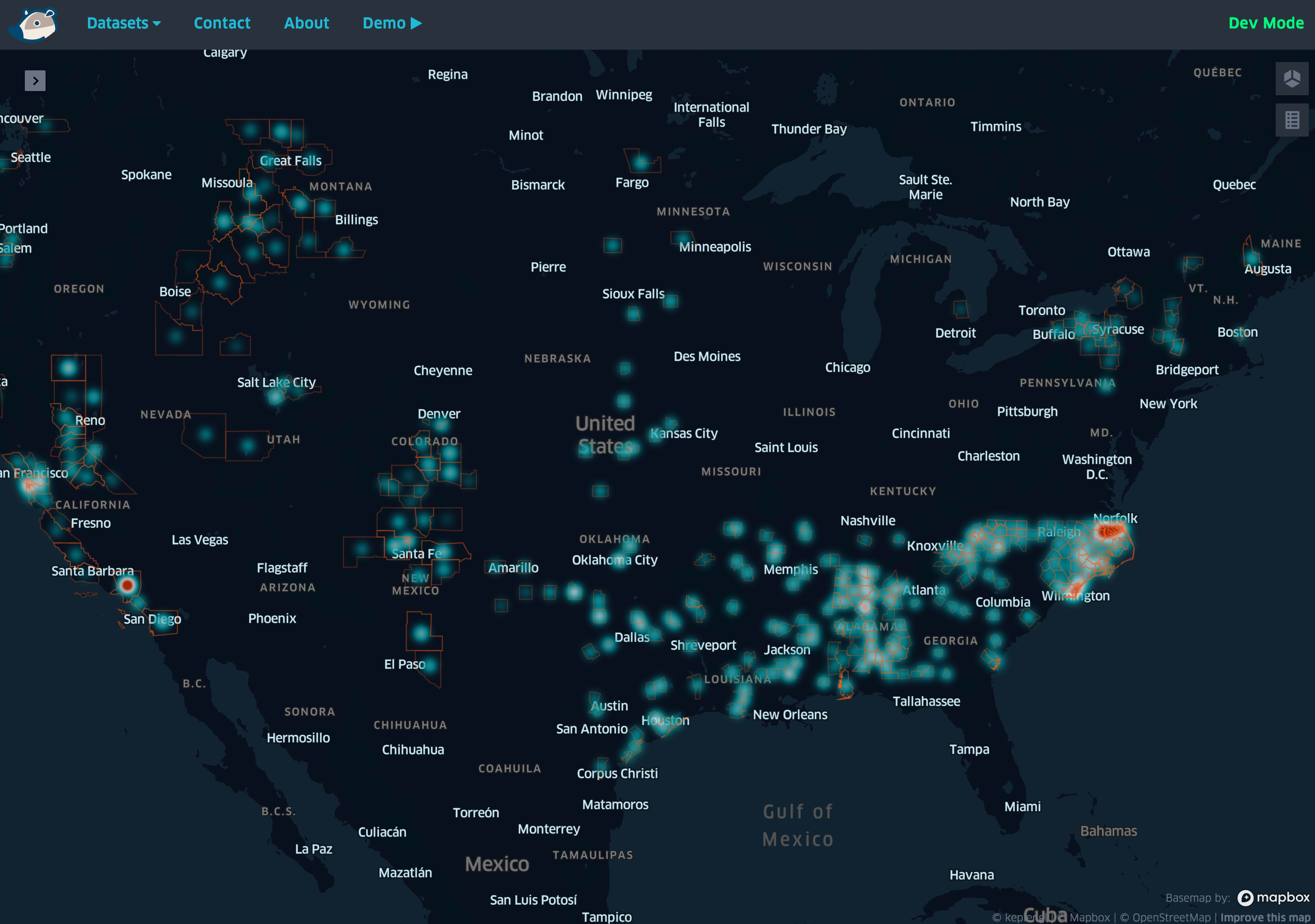
The third main view is titled “Heat Map” which highlights clusters of vulnerable regions of the country, defined by the proximity of vulnerable counties during a predicted outage. The screenshot below shows that based on the weather forecast for June 6-8, 2023, there are clusters of vulnerable counties in the Carolinas and Alabama. The entire southeastern region may become impacted as affected individuals from neighboring counties cross county and state lines in search of services.
The Technology
Data Prep
Data comes from multiple sources in different formats. The COATI core data sets are a mix of JSON, CSV, parquet, and some proprietary text-based formats. The variety of formats, compositions, and partitions necessitated preprocessing and transforming data into a common format before processing with machine learning. Python + Jupyter notebooks made this easy with a combination of pyspark, pandas, numpy, and fastparquet. Datasets were processed and merged in a multi-stage approach to arrive at a common data set that combines DOE outage data, US County map data, NOAA weather data, and third-party power outage data.
Model Training
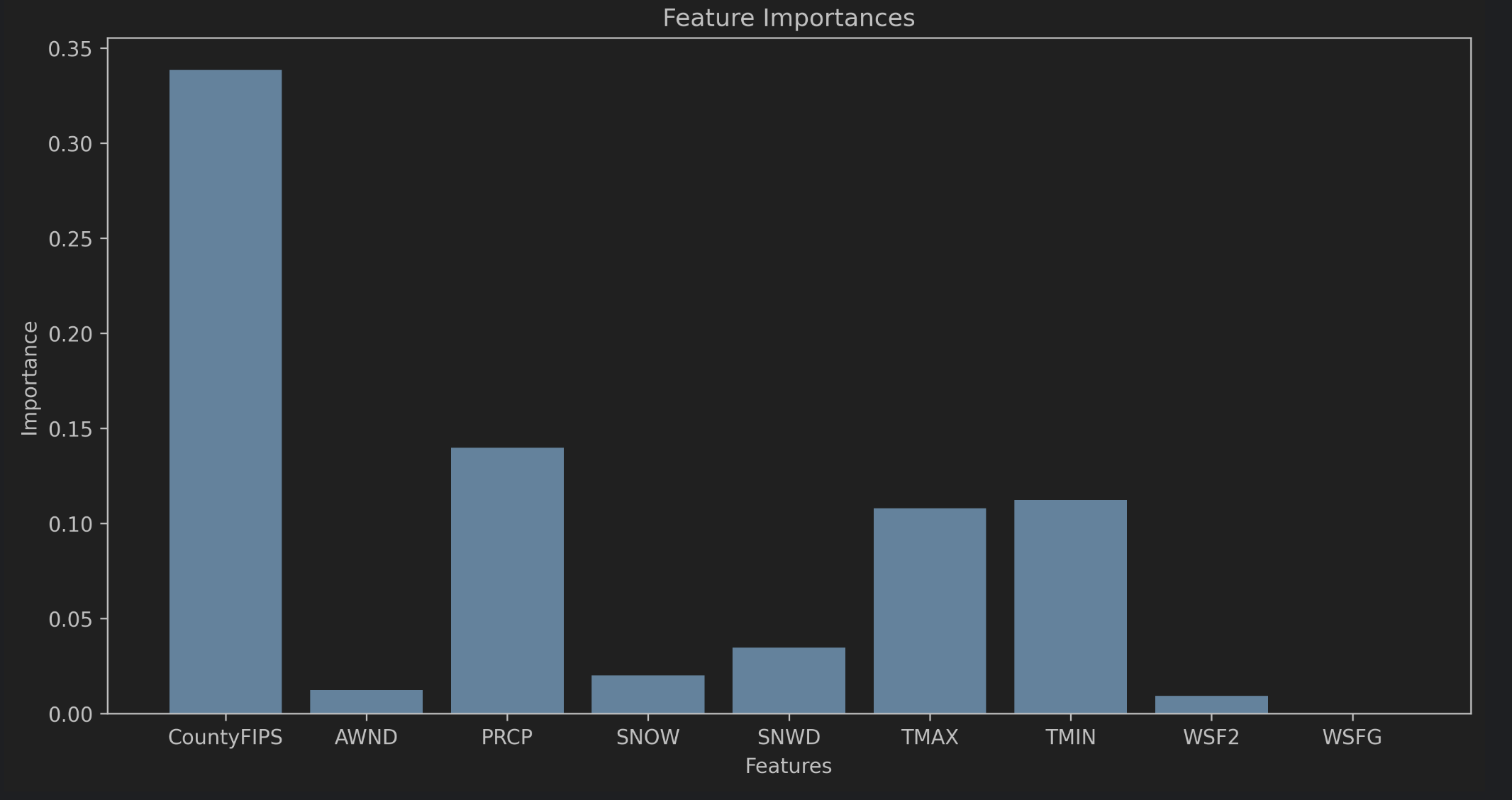
We experimented with as many inputs as we could get for training the model. Utilizing tools from the popular scikit-learn python package, it is possible to graph the relative importance of each parameter (feature) to the overall classification of data (see below). Interestingly, the county of residence was by far the most important factor in determining electrical outage probability. Upon reflection, this makes some sense as outages are probably strongly correlated with factors like geography, local tree failure, above vs. below ground wiring, etc.
The training was performed on a random subset of historical data using tools from scikit-learn for sampling. Multiple classifiers were analyzed to find the one that best fits our data including DecisionTree, LogisticRegression, RandomForest, AdaBoost, and KNeighbors. In the end, the RandomForest classifier gave us the best accuracy.
Predictions
We developed our tools to get seven-day forecasts for each country in the US and export them as a large CSV table. Our saved classifier model is loaded from a pickled state and the forecast data is fed in. The result is a large data frame that includes outage probabilities for each county on each day of the forecast.
Calculating Vulnerability
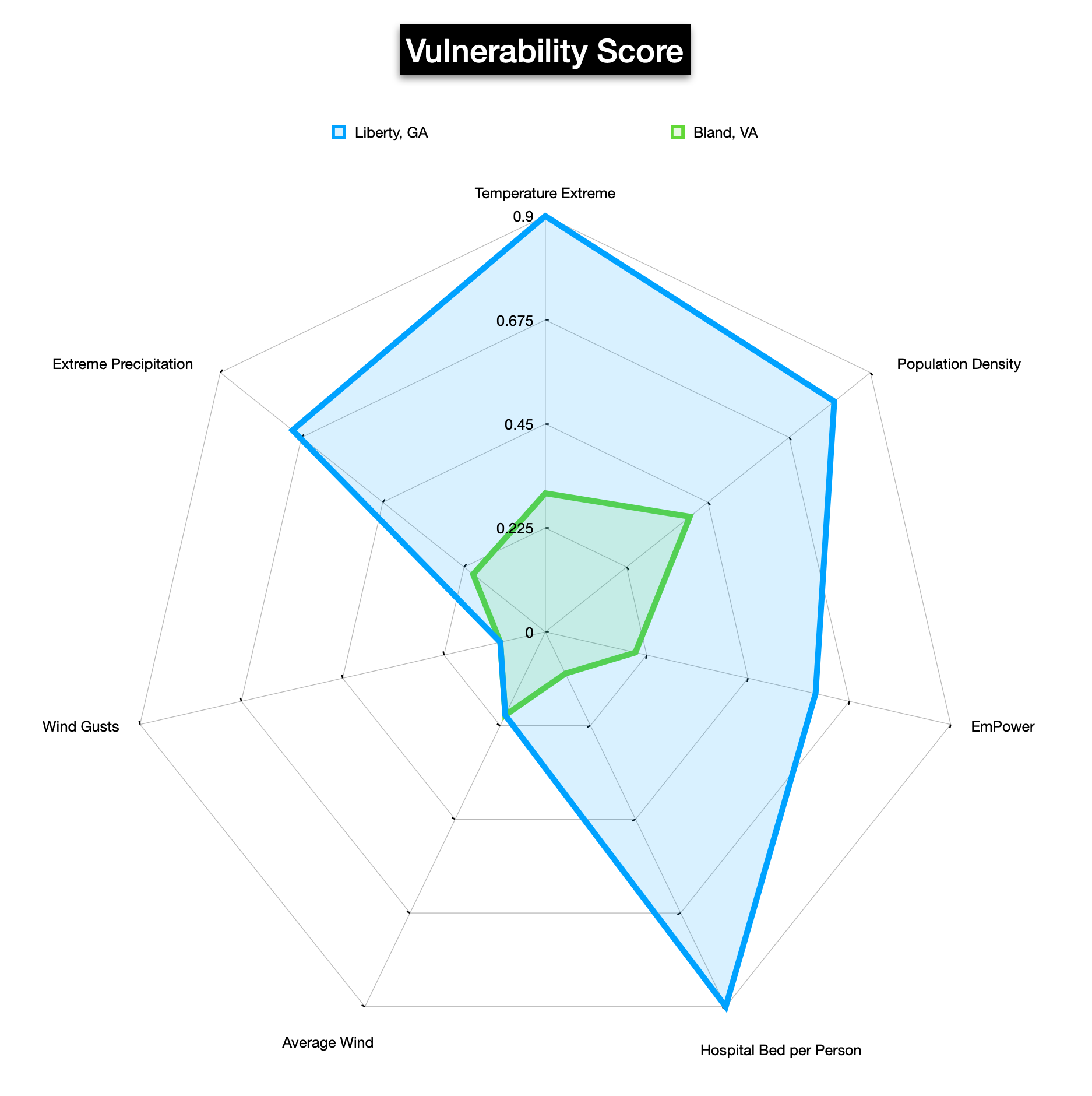
Simply predicting when and where outages would occur was only a part of this project – the real goal was to use this information to illustrate differences in health equity. Not every area of the country has the same access to health services with factors like geographic proximity to hospitals, bed counts, and population density have potentially significant impacts on the availability and quality of care available.
The vulnerability score is calculated with a variety of static factors (population, land area, hospital & bed count, and the number of local electrically dependent people) and dynamic factors from the forecast (extreme temperatures, excessive precipitation, high sustained winds & large gusts). These factors are scored individually and then combined to form an aggregate Vulnerability Score for a county. A high vulnerability combined with a high outage probability becomes an area of higher concern as the potential repercussions of a regional power outage are more severe (think heat stroke, hypothermia, flooding, downed trees, hospitals over capacity, etc.).
Presentation
The result of all this computation is essentially a large table of numbers…not an especially compelling or effective means of presenting, exploring, or gaining insights from data. To make this data more compelling, the CTAC team incorporated kepler.gl maps, an open-source framework for working with geospatial map data. It provides us with tools for filtering, coloring, and displaying data in both two and three dimensions to add visual appeal and readability.
Infrastructure
CTAC utilized the AWS Cloud Development Kit (CDK) to develop the underlying infrastructure as code (IaaC) for the project.
The CDK comes with a construct library for building code pipelines easily including support for multiple stages and deployment configurations. We built a two-stage pipeline with a manual approval process for the production environment. This allowed the team to have a rapid development cycle with significant feature changes going out dozens of times a day while keeping a “production” version ready at all times that is easy to demo.
For those not as comfortable with YAML and the idiosyncrasies of AWS CloudFormation templates, or if your team is looking for programmatic control of your template generation using high-level modern languages, the CDK could be a good fit.
The COATI system is completely serverless with a Cloudfront + S3 static front end, lambda-backed Api Gateway, and SQS + Lambda processing queue. For larger datasets or more complex models, AWS provides a host of powerful services, such as Macie, RedShift, Glue, and EMR to name a few.